HTML Models text
If you go to any decent website, it will have a heading (like the text above) and a body copy, like paragraphs and links.
Most people don’t know HTML(Hypertext Markup Language), as they can use tools like Google docs or Microsoft Word to accomplish their needs. If you are interested in seeing the similarities between the two, I discussed how word processors are an abstraction of HTML in a previous blog post.
HTML: more than just text
Even though HTML is mainly associated with marking up text (and text is part of the acronym), we can use HTML to model pretty much any media we encounter in the real world.
Us Developers can use the audio element - along with the src attribute to specify a path to the file. The audio controls gives control to the user of the audio, allowing for the pausing/playing and volume manipulation of the audio. It looks like this:
<audio controls src="/assets/media/cat-meow.mp3">
<a href="/assets/media/cat-meow.mp3">
Download audio
</a>
</audio>
or sometimes you may see the audio included via the nested source element.
<audio controls>
<source src="URL">
<source src="URL">
</audio>
The “Download audio” and anchor(<a>) element acts as a fallback and will only show as a last resort, when the browser doesn’t support the element.
When it comes to including video content in a website, we have multiple options.
The
videoelement. Similar to theaudiotag we just saw it,videohas the controls attribute with a nestedsourceelement. The following example is from MDN<video controls width="250"><source src="/media/cc0-videos/flower.webm" type="video/webm"><source src="/media/cc0-videos/flower.mp4" type="video/mp4">Download the<a href="/media/cc0-videos/flower.webm">WEBM</a>or<a href="/media/cc0-videos/flower.mp4">MP4</a>video.</video>Aside from the
heightattribute (you can always set the height and width with CSS), thevideoandaudiotag have a similar syntax. They both have the global (can be attached to any HTML element)controlsattribute, and nested elements that act as fallbacks when the browser doesn’t support the original tag.Via the nested
sourceelement, thevideoandaudioelement also allow for the inclusion of multiple media formats, allowing you to support the technological needs of all users.
The
iframe(Inline Frame) element. This is essentially a webpage within a webpage (it has separate HTML and browsing history). When you embed a video, like from YouTube, or an interactive map, you use aniframe. Here is an example from YouTube:<iframe width="560" height="315" src="path-to-file” title="YouTube video player" allow="accelerometer; autoplay; clipboard-write; encrypted-media; gyroscope; picture-in-picture; web-share" allowfullscreen></iframe>In regards to attributes, aside from
srcandtitle, I have no clue what the other ones mean. If you know, please tell me in the comments.
CSS, more than just styles
If HTML is for describing text and how to mark it up, CSS (Cascading Style Sheets) applies styles to the text. Those new to CSS most associate it with styling text with cool colors, but you can do so much more with it. CSS is used for:
Website layout
Grid and Flexbox.
Typography
Responsively sizing elements.
Importing fonts via the font-face rule
Importing external style sheets into the current style sheet via
@importImporting fonts via @font-face
Media queries to apply styles based off screen size and device.
And much more! In a recent project, I was challenged by Perpetual Education with making a beautiful article. It should be beautiful for all users who are consuming the content. Beautiful is a subjective, human concept, so I made sure to test with Humans too.
It doesn’t matter whether the user(s) are sighted, have a disability requiring the use of a screen reader, or are a web-crawler crawling my website to figure out how I should rank on a search engine. Also, the HTML should be validated, and the metadata should accurately represent the content of the article.
To achieve this task, and because the year is 2023, I did things the modern way (no div soup here), using semantic HTML elements and beautiful typography. This web page is subject to change as I receive feedback from users.
Testing with users
My teammate Brian gave me my first round of feedback. He suggested I improve the line length of paragraphs and headings and increase spacing between heading and body copy. I implemented those changes today. He also helped me debug my og:image metadata (I tested my article link in slack, and it kept showing me a cached version without the meta og:image) Thanks Brian!
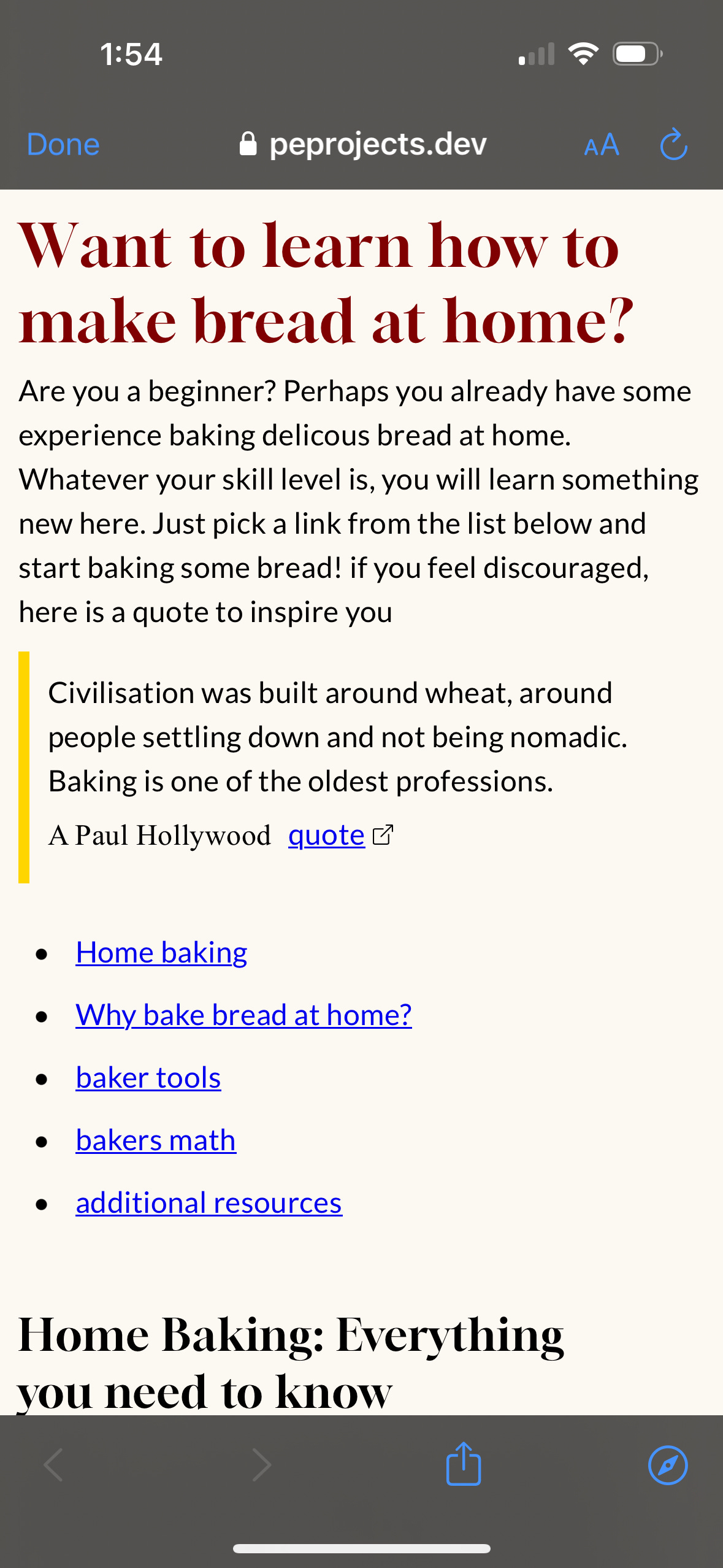
Another teammate (Andy) said that some of the letters in the heading font (Gloock) were too high contrast, rendering some letters (like the “o” in “how”) barely legible and looked “split”, particularly on mobile devices. Below is a screenshot he shared with me to illustrate his point.
It was suggested that the issue may be with the macOS anti-aliasing (the smoothing of jagged pixels), and I could fix it with -webkit-font-smoothing: antialiased; CSS rule. I have yet to test this (gotta finish writing this article), but hope it works!
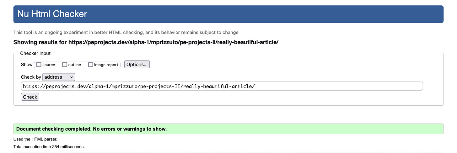
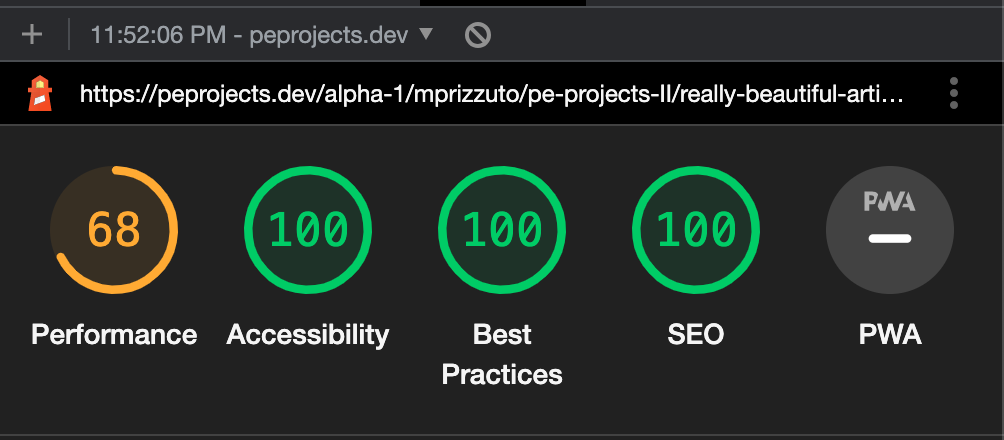
Here is a link to the article. I will be updating it as I get more feedback. If you have any constructive feedback, leave it in the comments! As of 3/2/23 the HTML is valid and the lighthouse (a chrome extension to check website performance) is almost perfect.
Choosing fonts
I admit, in my early days of learning HTML and CSS, I really didn’t give much thought to typography (the appearance of letters) and white space (the parts of a webpage without elements). If you have ever:
Gotten a long, poorly formatted text from a friend (or worse, an enemy) with no separate paragraphs
Struggled to read tiny text on a webpage
or find content on a tightly-packed busy page
Struggled to choose a card for a special occasion
Then you have been impacted by typography. It really matters, and like most things in life, we usually only notice bad typography when it negatively impacts us. Choosing a font starts with the emotions you want to convey and considering the needs of your audience- are they international? Some fonts don’t support an umlaut, like Ö, so better do your user research and choose wisely.
Similarity and differences matter
You wouldn’t pick a festive font associated with a holiday for a website about a medical disease, would you? For my article, which is about bread baking, I wanted the heading text to look like something you would see in a newspaper food column. Or perhaps a recipe book.
In contrast, it helps to use a different font for the heading and body copy. However, it is important that fonts complement each other. Much like human relationships, you want to have something in common with your friends but also differences too, otherwise, things get boring right?
To achieve that newspaper/editorial feel, I picked Gloock, a high-contrast serif font for the heading. For complimentary body text, I chose Lato. I admit the body text was a bit harder to choose and I had little emotion invested in it. I just wanted a highly- readable sans-serif font that I “felt” paired well with Gloock. I think I did well in this regard, but you tell me.
Both the Gloock and Lato letters have a similar geometric roundness to them. But due to the different font categories: serif (Gloock) and sans-serif (Lato) they were sufficiently different to make that much needed separation of personalities from heading and body content.
In case you didn’t get a chance to read my awesome article about home baking, I’ve included samples below.
Typography: Which CSS units to use
Picking the “right” font is important, but so is using the correct typography unit. Picking the wrong unit can limit the usability of a website(for example, text scaling poorly or not at all), which is always bad.
In typography, there are three types of units
Relative: Perfectly suited for print and screen media, these units are set relative to another value (typically the parent element or font size of the document). Given the responsive nature of relative units, and the positive impact on usability, these units are the most frequently used.
Headings and paragraphs are the elements most commonly sized with relative units. Users may need to increase magnification on their screen, and relative units facilitate this gracefully. The relative units are:
rem: Relative to the font size of the root element. Usually the HTML element.%: Relative to the same property of the parent element.em: Relative to the font size of the parent element, or the nearest element with afont-sizerule.ch: Relative to the width of the “0” glyph of the defined font.ex: Relative to the x-height of the defined font.
Absolute: Specifies a fixed height. Regardless of changes in screen size (height or width). Physical units (e.g. cm, mm, in, pc, and pt) are especially suited for the CSS used for printed media.
Absolute units are fixed, meaning they don't responsively change to the size of the browser window or device being used to view the webpage. If you have an element that needs to maintain a specific size or position (like a logo or nav element) then using absolute units are your best bet.
Note that while physical units, like 1cm should print the same as 1cm on a ruler, it may not render on the screen as 1cm. Also, keep in mind these are units of length.
cm(centimeter)1 cm = 1/100 of a meter.
mm(millimeter)1/1000 of a meter.
in(inches)1 in = 2.54 cm.
pc(pica)1 pica = 12 points.
pt(point)1 point = 1/72nd of an inch.
px(pixel)A single point on a digital image. When specifying units as px, each px corresponds to a pixel on the screen.
Viewport units: Similar to relative units, this is another type of responsively sized unit. They are based on the size of the viewport.
If you want to size elements based on the size of the browser window (like a background /full-screen image), viewport units are the unit you need. The viewport units are:
vw(viewport width)Set relative to the viewport.
vh(viewport height)Set relative to the viewport height.
How software interprets HTML
Earlier on I mentioned the importance of choosing modern (non-deprecated), semantic HTML for web pages, and how it impacts ALL users (humans and robots alike). As a markup language, HTML not only dictates how the browser should markup content, but it also tells the software how to interpret the web content.
Web crawlers
In regards to web crawling software (like the kind search engines use to index and rank websites), a type of software called a bot will scan billions of web pages for internal (pages that link to each other) and external (links that link to another website) links (via the HTML <a href=””> element) to understand the purpose of the page.
Web crawlers also crawl the metadata and words on the page to determine site content, and use it to serve the results you see when you search for a topic. Using metadata, you can even control (well, suggest is a more accurate term) what the crawlers should focus on and ignore. But enough about robots, let’s get back to the human element in this story
Screen readers
HTML also benefits users with poor (or no) sight. A screen reader is a software that reads the text content on a screen out loud. There are dedicated screen reader software, some of which are paid(JAWS) others of which are free (NVDA, Orca).
I have never used dedicated screen reader software, opting for the voice control program that came bundled with my Mac. The voice control program allows you to use your Mac with voice commands only. As an accessibility newbie, I haven’t used this feature either!
Along with using the tab key to navigate the page, what I did use voice control for was to check my article for accessibility issues. Not only was the software able to read the text between the HTML elements, but it also told me the HTML tag used (i.e heading or paragraph).
If you have a Mac, go ahead and try it on my article. If you notice any areas that need improvement regarding accessibility, let me know in the comments! And if you have dedicated screen reading software, please have it read my article to you. Much like humans, different screen readers have differing “reading” styles and interpret content differently!


