
Making a business card website
Making a business card website
Conceptualizing, researching, and documenting a project

I am a stubborn man
I have vivid memories of a pre-pandemic world. Picking random designs I found in my web wanderings, and remaking them (sometimes poorly) in CodePen. Who doesn’t love a random project? They can be a fun way to learn something new and blow off some steam (and procrastinate what you should really be doing).
Well, that came all too easily to me. Part of my memories include me sitting in my room on my laptop talking on Discord with Derek, my Perpetual Education Web design teacher. He was all too aware of my tendency to stray from my goals! So he told me that if I want to get hired, I should stop fiddling around with making random designs and focus on making my business card website. I begrudgingly agreed.
Since last year, I’ve iterated through countless versions of my personal business card website. Here I will document my process of my most recent iteration.
Business card website: A case study
The goal of this project was to create a website version of a physical business card. While this may sound simple (how many elements does a business card really have?), I struggled to find any websites in the wild to compare the concept to. Which isn’t surprising considered how many over-engineered websites with unclear goals their are out in the wild.
Research
My research involved first googling “business cards” to get an idea for the visual design. I then stripped the elements of the card down to the bare essential elements that fit the projects requirements (name, job, contact). I used the images I collected in my research (that were in my visual design inspiration folder) and made a collage, in an attempt to start picking out some visual tricks.
What I originally thought I should do was immediately start coding up a website using HTML and CSS, but my Perpetual Education design thinking kicked in, and I put a google docs together to act as a repository for my research. I showed my work to my colleagues and Mentor at various sprints in the project, and they provided invaluable insight.
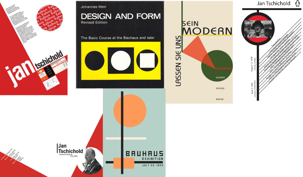

As you can see, I really appreciate bauhaus and graphic design. What I discovered from analyzing these images is that you can break the rules (visual assymetry, vertical text), but only after you know them. Also, you can use these rules to lead the eye around the page while implementing visual tricks.
Content strategy
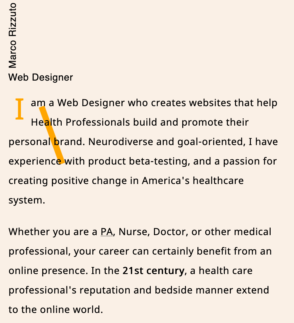
This is another area I underestimated. Because I am designing a website and not a tiny business card, content was an issue. I had written my LFPS (laser focused positioning statement) and XYPS, so I primarily leaned on that for content. I knew I wanted (want!) to create websites for health professionals that are also social influencers, so I made sure to mention that right away on the webiste homepage.
By putting my expectations for the type of work I want front and center, I can save everyone time while also preserving my sanity!
Exploration and feedback
Luckily for me, between the images I accumulated in my visual design folder and the cool videos I watched as part of my Perpetual Education homework (looking at you Helvetica) I had plenty of exploration time.
Like I mentioned previously, I got amazing feedback from my teammates which I implemented to the best of my ability. For example, Jevohn suggested I clarify some of the terminology for my target market. Derek Mccall suggested I add more copy so readers could get more of a feel for my personality. Because after all, you aren’t just hiring a person for their skills, but their personality too!
Visual language
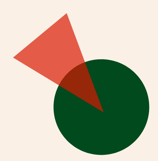
As a visual design fledgling, I struggled to tie all the amazing stuff from my visual collage into a cohesive visual trick… at first! I decided to embrace the geometric patterns and poster art feel from my visual college and create some SVGs.


Putting it all together
With my custom SVG’s made and my content tested with users, I felt like the homepage was looking pretty good. I moved on to the experimental page (a page to house cool layouts and other fun stuff) and my writing page, a page with links to my blogs. This page also might be a blog in the future, who knows!

I admittingly only got feedback about my homepage, so I would appreciate it if you went to my website and told me in the comments your general thoughts about my two other pages!
Some general questions
What is the tone of the page?
Does the experimental page clearly highlight the various “experiments” ?
Did the pages load effectively on your device?